Happy Easter!

Yeh!  It’s time to decorate the eggs!

Photoshop is fun, but it does lack the great smell of vinegar and messy color play that goes with dyeing eggs with food coloring!

Have a creative time decorating your eggs with your favorite technique!

Here is a half dozen decorated photographs from our Easter Egg series:

Color Spinning Exercise, Part II: Introducing “Wool Kitty”

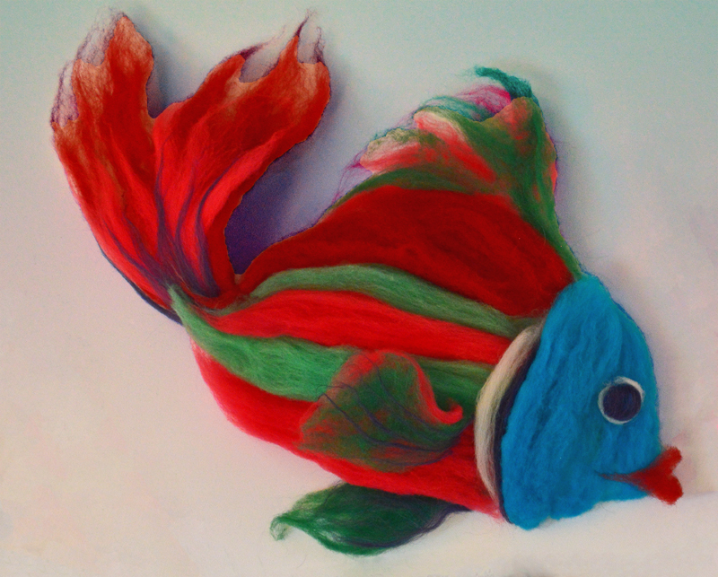
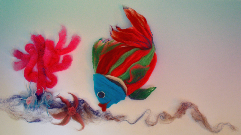
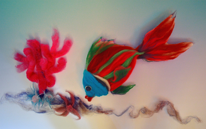
It is possible to get too caught up in the final goal – enjoy the journey and make something for the sake of making it!

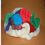
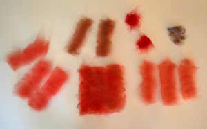
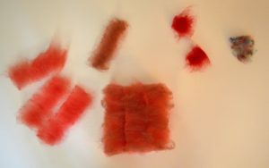
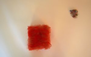
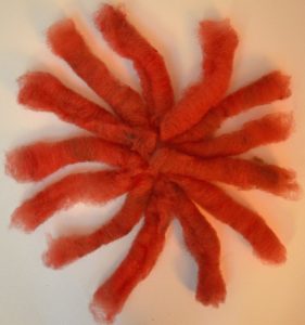
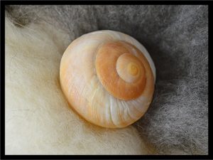
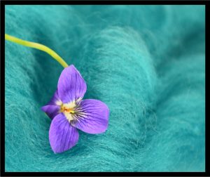
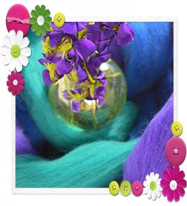
From this stash of fiber . . .


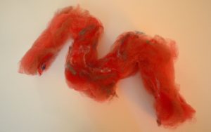
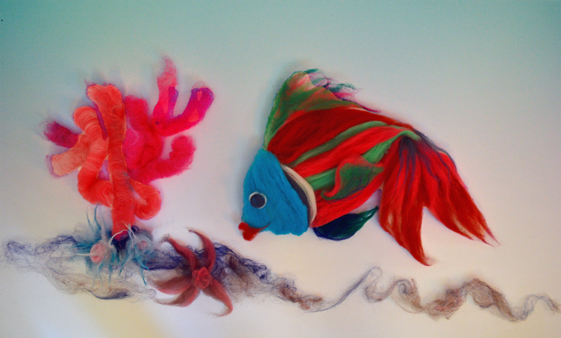
Introducing . . .  Wool Kitty!

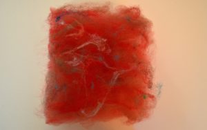
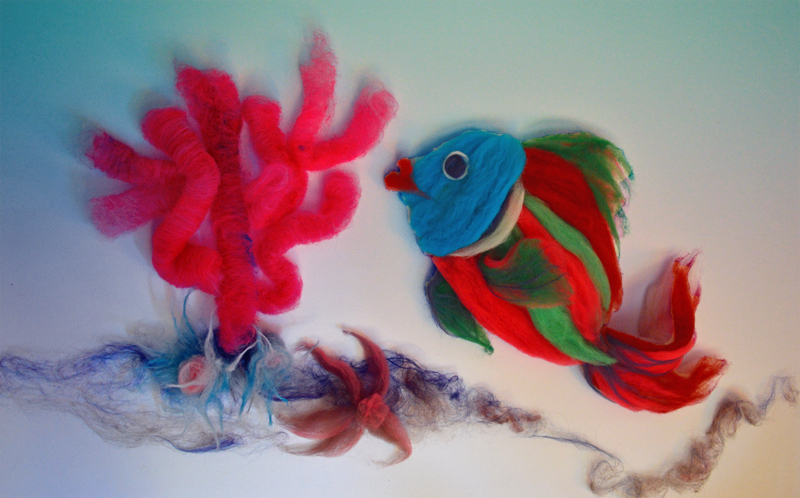
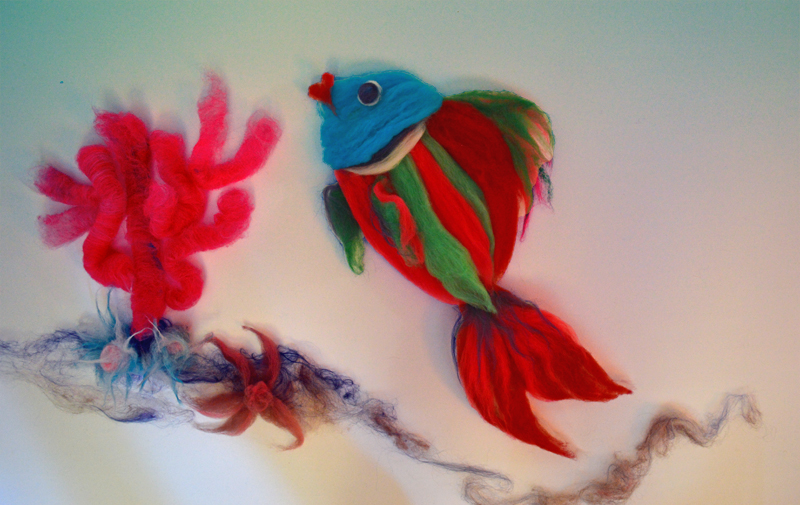
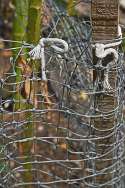
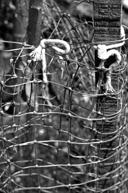
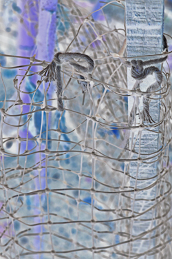
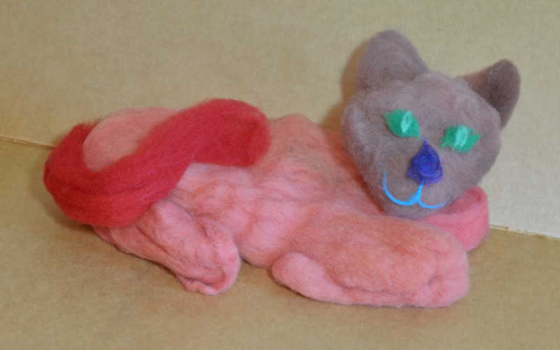
Wool Kitty is ready for a nap on the Dressmakers cardboard!

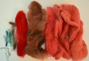
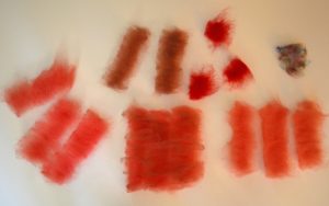
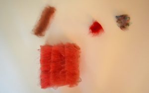
Admittedly, not an overly daring color combination, but this collection of colors probably wouldn’t have happened without this stage of making the fiber into an image before carding.

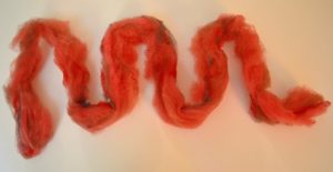
The figure is held together with hairpins so it is easily taken apart.   Since it was created only for the photograph we didn’t get overly attached!  Spontaneous creativity is like a vacation from deadlines (even self-imposed ones).

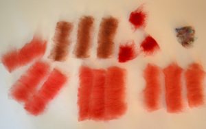
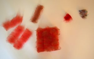
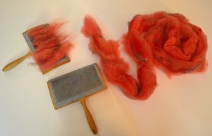
The fibers that went into the making of “Wool Kitty”:


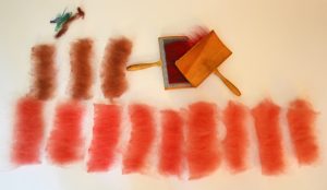
Since the fibers were compacted from long storage, a little carding set everything up for choosing the arrangement for the final yarn.  What order would you imagine using?
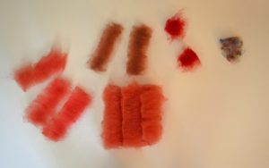
 

The recipe:

Side view of fiber stack:

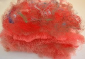
Dividing the stack to elongate it:


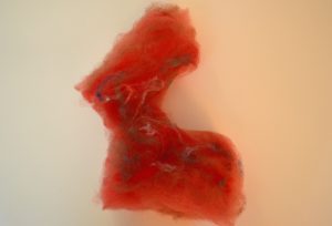
Then we changed our minds and wanted the colors more blended.  Allowing yourself the opportunity to change your mind can be a rewarding part of this exercise!

More carding!


Carded rolags ready for spinning!


Or, another way to look at it:

Carded rolags waiting to spin!


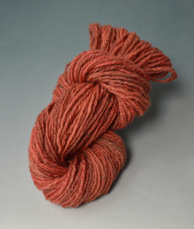
As the spinning progressed, the yarn took on a new look and personality.  “Wool Kitty” transformed into “Firescale”!  Playing with new titles is also a creative activity.

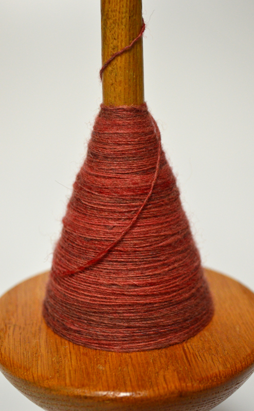
Working title:  “Firescale”, single ply yarn spun on a low whorl drop spindle

Finished skein, the colors zones are more muted as they are recombined in plying.


Comfort zones – Part II: more fundamentals

Since we’re reviewing art school fundamentals, another classic one is that artwork’s presentation can really change based on the background color.  While we can’t change this particular post to a black background without changing the entire website, these photographs with a black frame will give a bit of an idea for comparison.

We have mixed reviews on which photographs benefit from this black frame.  The harsh dark frame looks contrary to the soft texture of the fiber in both the photographs of the snail shell and violet.  For the value scale example in the middle, since the black frame picks up the black band in the clam shell and black fiber on the left side of the photograph it works to enclose the right side, which would otherwise seem to spiral out of the composition.  The final example provides this post’s punchline!

That is how it is in the studio, sometimes you have to try out several ideas to find what really works best.  If we were actually finishing these photographs, none of them would end up with this very narrow black strip, but it is a starting off point for more ideas.


And while a simple coordinating matte can really finish a photograph, if the frame and the contents don’t enhance each other . . . well, see for yourself . . .
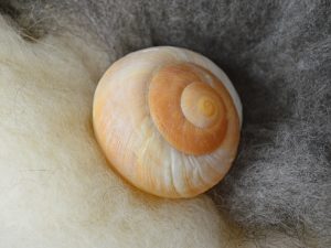
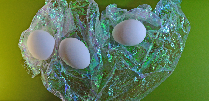
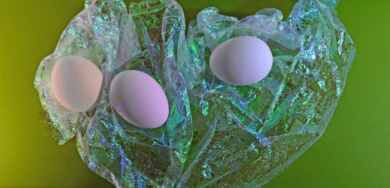
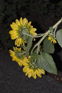
Shall we call this “discomfort zone”?!!!


Yellow, Red, Orange – Part III: Distant Close-Ups (or, No Sunflowers were harmed in the filming of this post series)

When our uphill neighbor grew these amazing towering sunflowers, how did we manage to get photographs like this with a macro lens?

The answer is sometimes you have to put the Photographer on a tripod!

Photographing at Dusk with a flash and close-up focus prevented the sunflower centers from appearing as a flat black disk, especially for photographs later converted to black and white.

That combination of lighting also tuned out the cars, mailboxes and houses nearby.


The seed packet promised beautiful-bountiful-bunching-blooms (try saying that 10 times fast!), which have been a delightful subject to photograph.


They also provided the challenge of learning how to  aim around and Photoshop out extra blooms for the parts of the Yellow, Red, Orange Tale that focused on a single character/flower.


We’re sure that sunflower seeds must be brain-food, since the flowers have exercised our brains so much!

Yellow, Red, Orange – Part II: Working Title


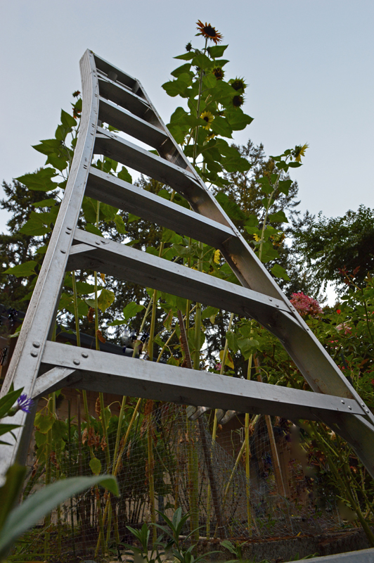
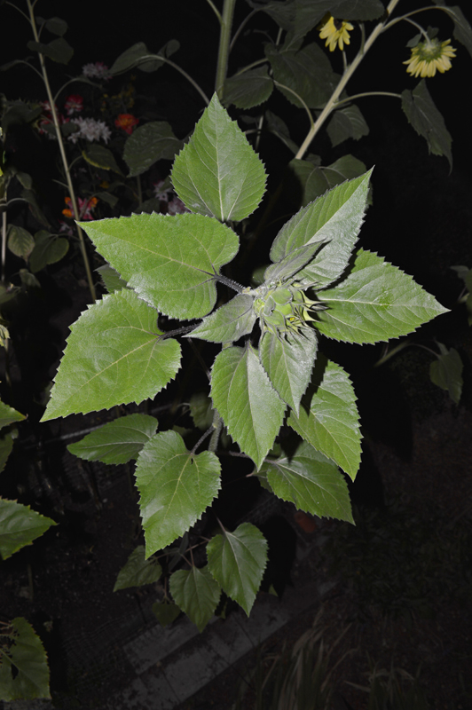
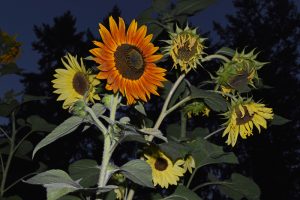
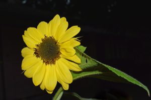
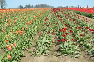
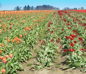
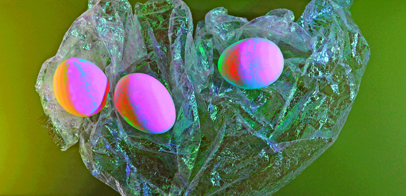
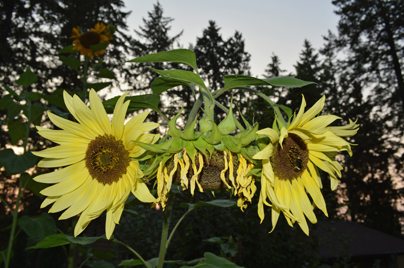
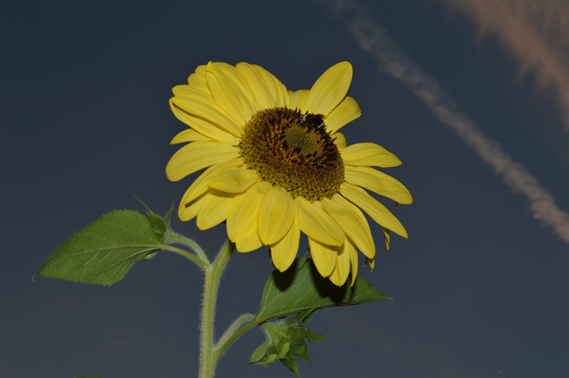
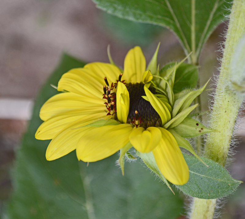
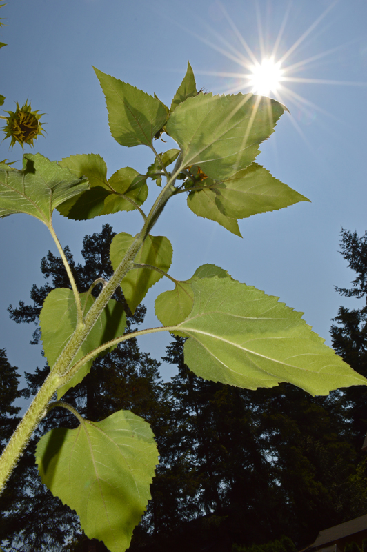
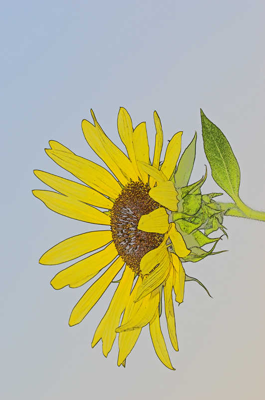
“Photoshop vs. Nature:  Smack-down in the Garden!” . . .  catchy  right?  This was our Tale’s first title.

We wanted an interesting presentation to show a sampling of  post-photography color changes.

A. As the camera saw it 
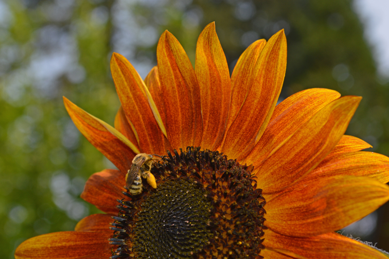
B. Brush, color replace
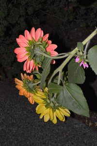
C. Adjust hue/saturationD. Paintbucket

However, as these wonderful sunflowers grew, this working title didn’t really match the garden’s mood.

When our Garden-Enthusiast Neighbor and her husband put up this netting to protect the sunflower bed from local wildlife, the young plants looked like toddlers peeking their noses over a playpen as they grew.

Then, as the flowers inspired photographs like these . . .

. . . the gist of the tale gradually became a moment of inner conflict on the path to maturity for the young “teen”flowers.

There is a certain irony with the plot of the tale, since photographing the flowers was actually the most peaceful time of the workday!

Happy 4th of July – Part II: Technical Follow-Up

Sometimes everything works out the first time.

Right time + right place + right camera settings = Happy Photographer!

The flag photographs for the 4th of July post have not had any post camera work.  The 3rd photograph is flipped for the waving flag layout.


What a brief technical follow-up!  But wait, there’s more . . .

Isn’t Creativity’s favorite question “What if?”?

So, in the spirit of “What if?” we tried out these Photoshop filters to see what the results would be.


(Filter, Artistic, Brushstrokes, Sprayed Strokes, Flipped)

As an enlargement this flag looks like it was sewn out of terry cloth.


Now that’s Flag Waving!

(Filter, Distort, Wave Selection)


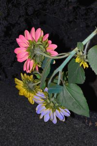
(Filter, Texture, Stained Glass)


(Filter, Chrome)


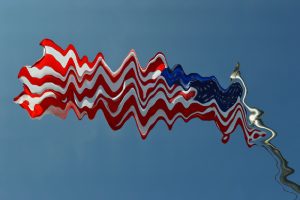
“Star-Spangled Abstract” (Enlarged, Cropped, Rotated part of Chrome filtered version above)

“What if?” can certainly take artwork in an unexpected direction.  Possibly leading to a future blog post theme!


Computer Holiday – Part II: Technical Follow-Up

Before:

After:


By the time we arrived at the tulip fields, the sun was full blast and there was a strong wind stirring up quite a dust cloud during the whole afternoon.  The dust actually emphasized atmospheric perspective and was kind of interesting in some other photographs, but for this one we wanted a stronger blue as a complement to the orange zones of color.  This is the first time we have tried the blue sky tool in Photoshop – one “click” and instant postcard type sky!  The overlay of blue also darkened the far distant trees as well.  Don’t worry, we won’t overuse this feature, we tend to like the whole range of colors that our skies can be!  Even though this is the first noticeable change in the before and after views, we recommend that all other photo. altering takes place first and the blue sky added last.  It will save dozens of “UNDO” clicks!

Still experimenting with the “Spot Healing Tool” and learning about the “Eraser tool” – that’s how the oak tree’s branches were removed from the left-hand border portion of the sky.  We had pretty good results with removing several of the images of people, some of whom ended up cropped out anyway (oh well, it was good practice!)  Some funny results happened in removing the people standing in the red tulip rows, the lower portions of them were completely replaced with red tulips with the first swash of the “Spot Healing Tool”, but removing the parts with the sky in the background was a huge effort, and still left a blurry distortion.  So, the lesson here is:  when learning to Photoshop . . . tiptoe through the tulips!

Speaking of tulips, we didn’t alter the colors or strong contrast since we were happy with the results.


Happy Father’s Day – Part II: Technical Follow Up

Before and after examples of another photograph from the “First Camera” series illustrate the Photoshop changes.

Before:                                                                              After:


Before

  • Bright idea – to avoid a plain dark rectangle on a light background use mirrors to add interest!
  • Challenge – mirrors reflect EVERYTHING in a small room and have strong edges that become part of the composition.
  • Solution – drape the door with yardage, stand on a chair and aim the camera into the room from the hallway, crop very close to the image to trim away EVERYTHING that is also reflected.
  • Happy accident – the strap and its reflection form a bow!

After

This was a chance to practice using several Photoshop tools, sometimes with very subtle changes.  Working from the original (after cropping) took a lot of trial and error since the background areas were so even.  The “UNDO” button is still very useful!

  • “Paint Bucket” – set to a very low percentage, this tool was used to reduce the brightness of the wedge of the door reflection at the top of the photograph. We liked how it echoed the angles of the little camera, but it needed less contrast so it wouldn’t compete with the subject.  Using a higher percentage darkened the entire background and made the whole thing seem grim.
  • “Heal Tool” and “Spot Heal Tool” – look like a bandage and a bandage on a key chain in the Photoshop side bar.  These features took care of the tiny white line at the very top edge a little toward the left (reminiscent of a scratch on the negative – a hazard in the good ol’ darkroom days).  Removing the lines from the edge of the mirror running through the center of the photograph took patience.  With practice, this will probably become a very useful tool!
  • “Convert to Black and White” – there are several choices even within Black and White.  We picked “Portrait” and reduced the contrast and increased the blue light intensity (both are a sliding scale so the degree of change can be accomplished with nuances).

Having both color and b&w options for photography is rewarding for artists, although not necessarily an instant result!

(P.S. website note:  creating bulleted lists makes all of the double-spacing between items disappear.  This post may end up being edited a few times until we like the layout.)