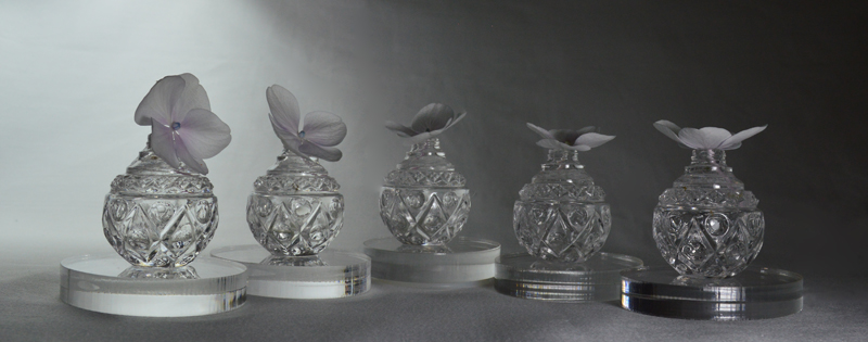
This color photograph is from a series we took to practice Still-Life Studio Lighting. The set-up is white flowers in clear glass, on clear acrylic, on a white background with two lights.
There are some duplicate features on our digital camera and on the computer’s Adobe Photoshop. So, this seems like an opportunity to continue the experiments with this photograph and compare the choices.
Camera : Warm filter Photoshop: Warm filter
Camera: Cool filter Photoshop: Cool filter
Camera: Black and White Photoshop: Black and White
Camera: Cyanotype Photoshop: Cyanotype
Camera: Sepia Photoshop: Sepia (click on the “brown tree” image)
Photoshop: Purple (click on the “Purple Tree” image) Photoshop: Red (click on the “Red Tree” image)
 Photoshop: Green (click on the “Green Tree” image)
 Photoshop: Oops! Ran out of Tree images to click on!
Interesting. Reaction: casting a warm or cool light on the actual still-life set-up resonates more with us for the immediacy of making and taking the picture.
The B&W setting on the camera looks useful for assessing the arrangement of hue values, especially when making a composition mixing matte and shiny items. The larger screen of the computer makes it easier to decide on nuances for later black and white conversions.
Also, how much influence does the viewing screen light have over the photograph colors? We’ll have to print up some of these examples eventually to really compare all of the options.
Frankly, there is a pretty good chance that we won’t press that Purple button again until we have a photograph of a cow (sometimes you just have to go with the obvious!)