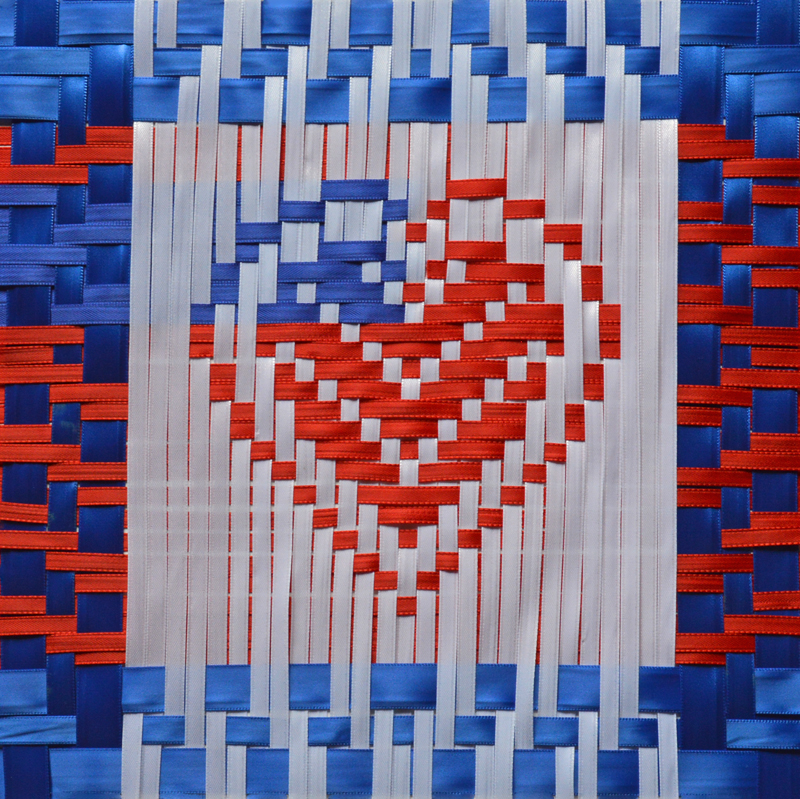
“Red, White and Blue Love” by Allyson and Kristin Metcalf
“Red, White and Blue Love” by Allyson and Kristin Metcalf
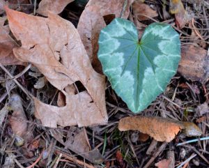
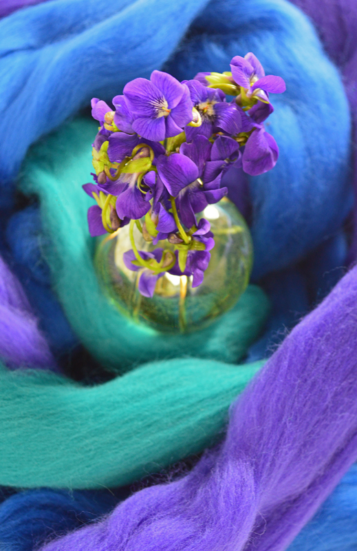
We love finding inspiration in our yard.
Sometimes, we are inspired by the love growing in the yard!
Plants in Photographs are:
 From the previous posting you can tell that for the third example in this series not only are we warmed up, but we are also starting to have fun with the whole layout and photograph part of the project. That is the benefit of an exercise, getting really “into it” and stretching the original ideas (and letting yourself be stretched in the process).
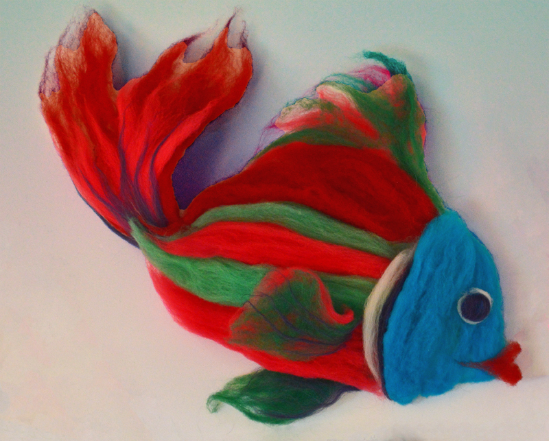
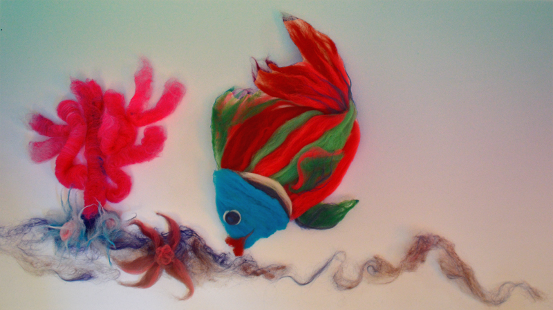
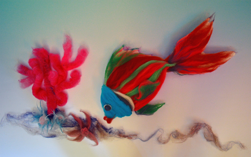
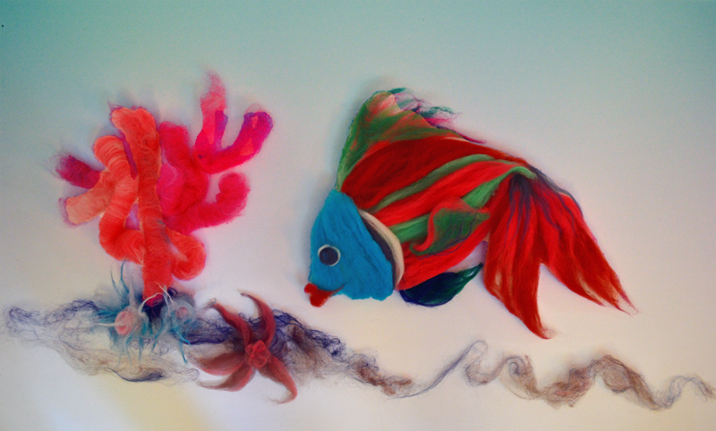
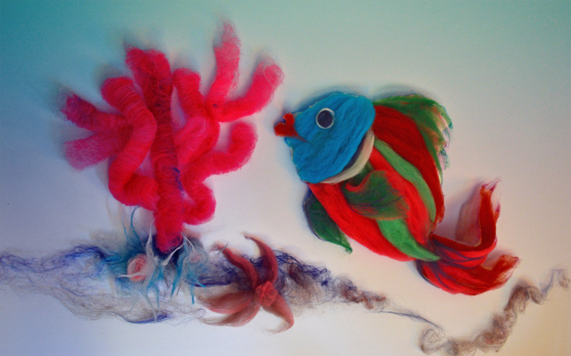
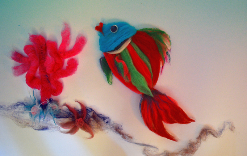
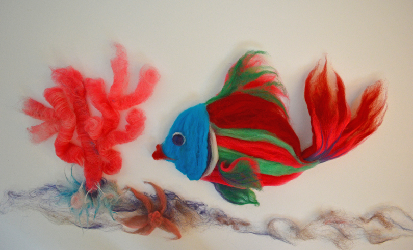 Kissy Lips, a Rare Roving Fish with Rolag Coral and Anemones (the starfish worked its way in when we weren’t looking!)
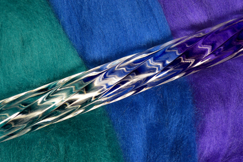
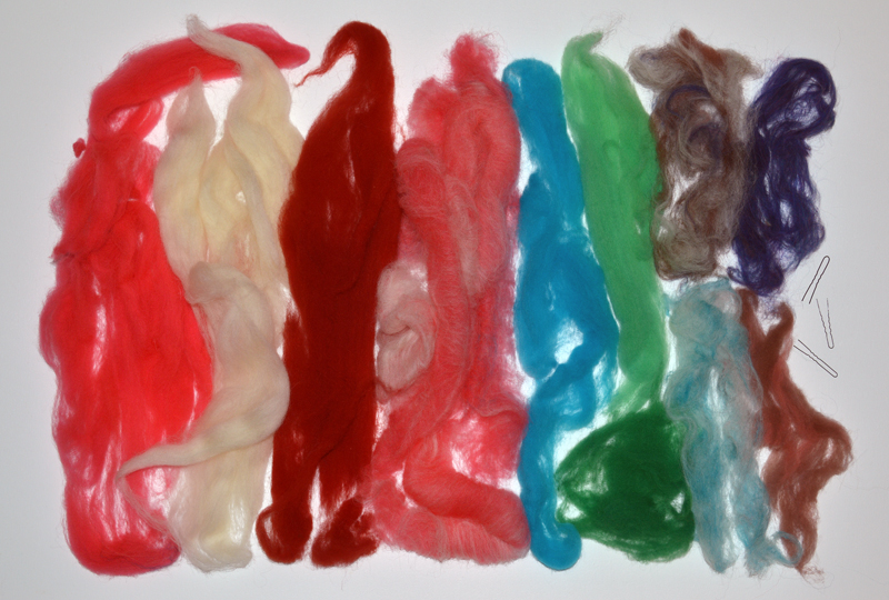 The wool colors that made up the Kissy Lips composition, including the hairpins that held it all together.
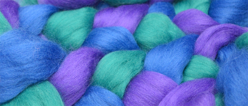
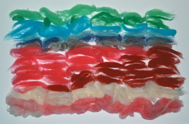 Dividing up the colors in preparation for carding. This stage helps to plan out the color progression throughout the skein. I think of it as creating a recipe for the yarn.
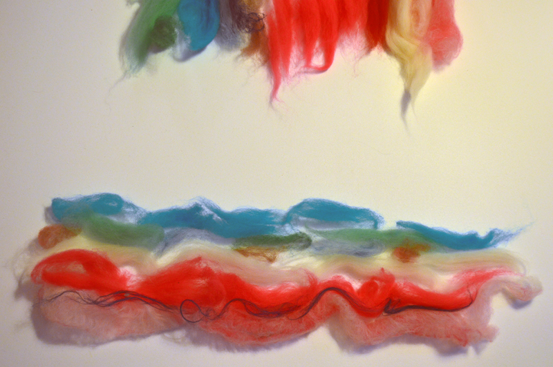 Further dividing up the wool for carding into each rolag.
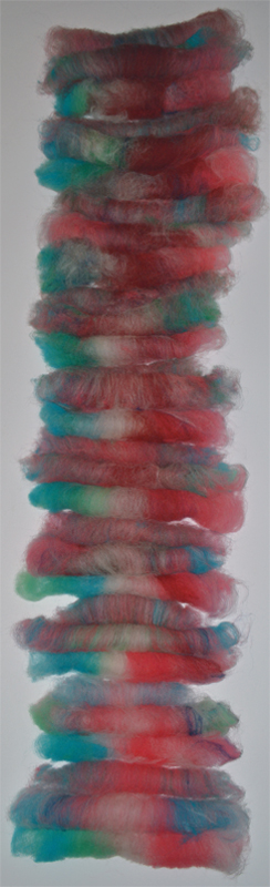 All the carded rolags in order waiting to be spun. So far, none of this project has been somber!
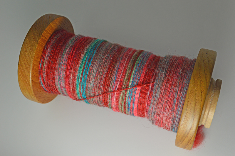 Working name: “Farrell’s Ice Cream Parlour”. Lively single S-twist yarn spun and wound onto a bobbin made by Bob Metcalf. As the carded wool transformed into yarn, the colors passing by reminded me of that famous ice cream parlor from our childhood, recalling smells and sounds (that drum that announced birthday sundaes was SO loud!) and brought back memories for friends too when I described the sensations.
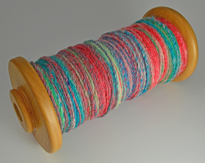 The single was chain-plied with a “Z-twist” forming new color combinations throughout the length of the yarn. This time, instead of the yarn stirring up memories, the colors gave me ideas of combinations to try in the future. Every few inches was a color mixing sample swatch. More wool! More yarn! More time! Please!
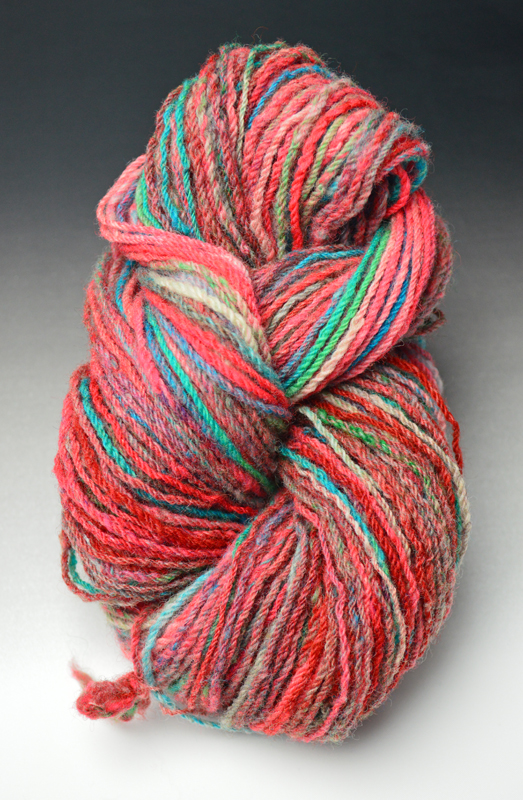 Finished skein.
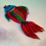
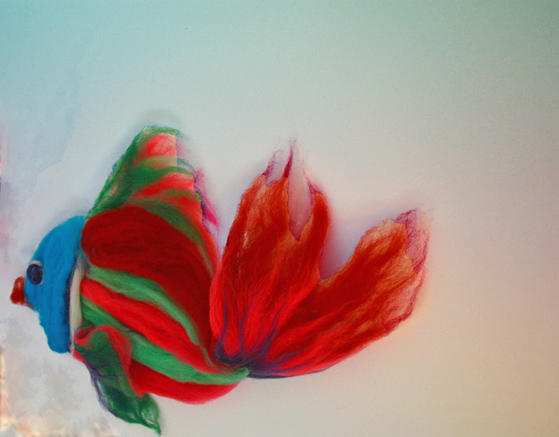
What do you think Kissy Lips?
Recently sighted (or should we say “sited”) . . .
Quick! Get the camera! It’s Kissy Lips – a Rare Roving Fish!
“Later, Dude!”
The trouble with Rare Roving fish is that they don’t stay still!
We send you all warmest wishes for a very Merry Christmas!
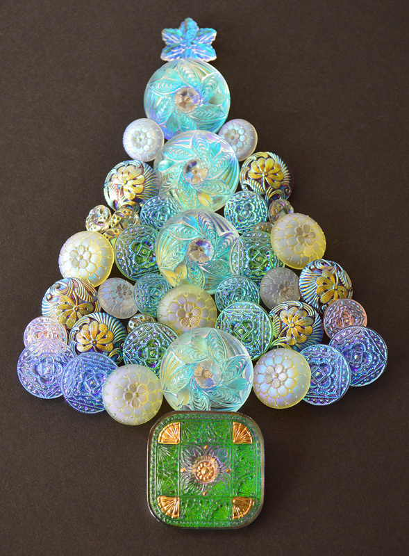 Christmas Button Tree by Allyson and Kristin Metcalf
 Grateful for Simple Blessings, By Allyson and Kristin Metcalf
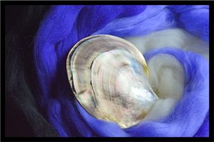
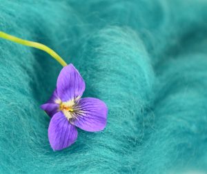
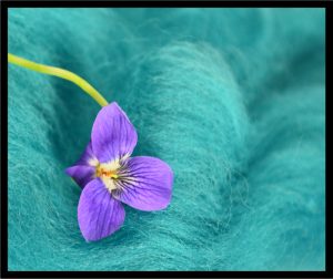
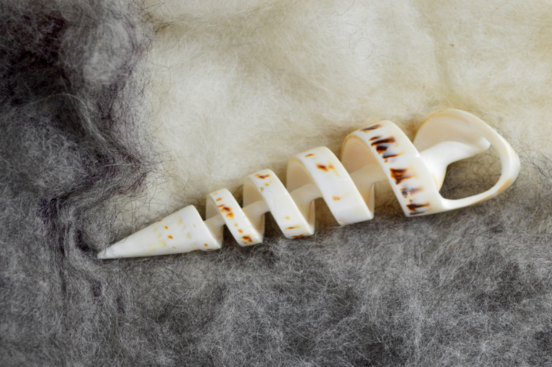
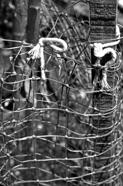
Since we’re reviewing art school fundamentals, another classic one is that artwork’s presentation can really change based on the background color. While we can’t change this particular post to a black background without changing the entire website, these photographs with a black frame will give a bit of an idea for comparison.
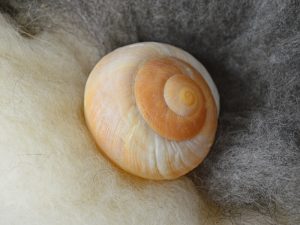
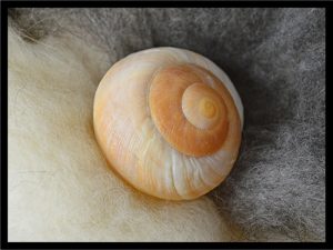
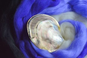
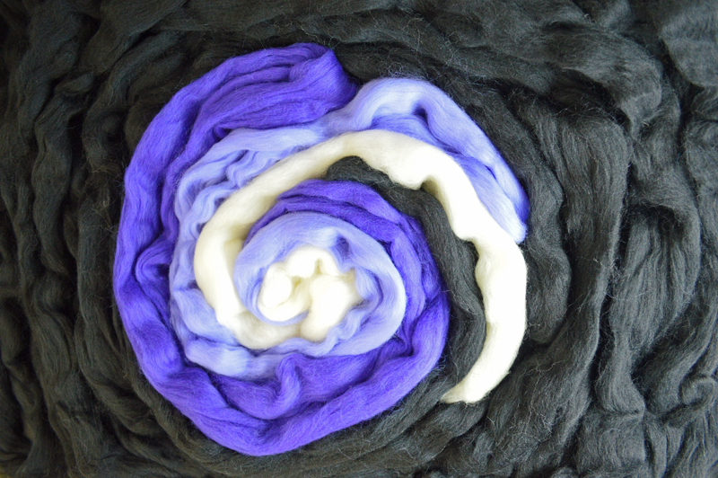
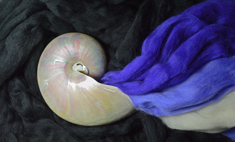
We have mixed reviews on which photographs benefit from this black frame. The harsh dark frame looks contrary to the soft texture of the fiber in both the photographs of the snail shell and violet. For the value scale example in the middle, since the black frame picks up the black band in the clam shell and black fiber on the left side of the photograph it works to enclose the right side, which would otherwise seem to spiral out of the composition. The final example provides this post’s punchline!
That is how it is in the studio, sometimes you have to try out several ideas to find what really works best. If we were actually finishing these photographs, none of them would end up with this very narrow black strip, but it is a starting off point for more ideas.
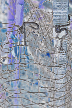
And while a simple coordinating matte can really finish a photograph, if the frame and the contents don’t enhance each other . . . well, see for yourself . . .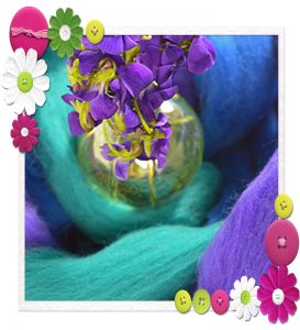 Shall we call this “discomfort zone”?!!!
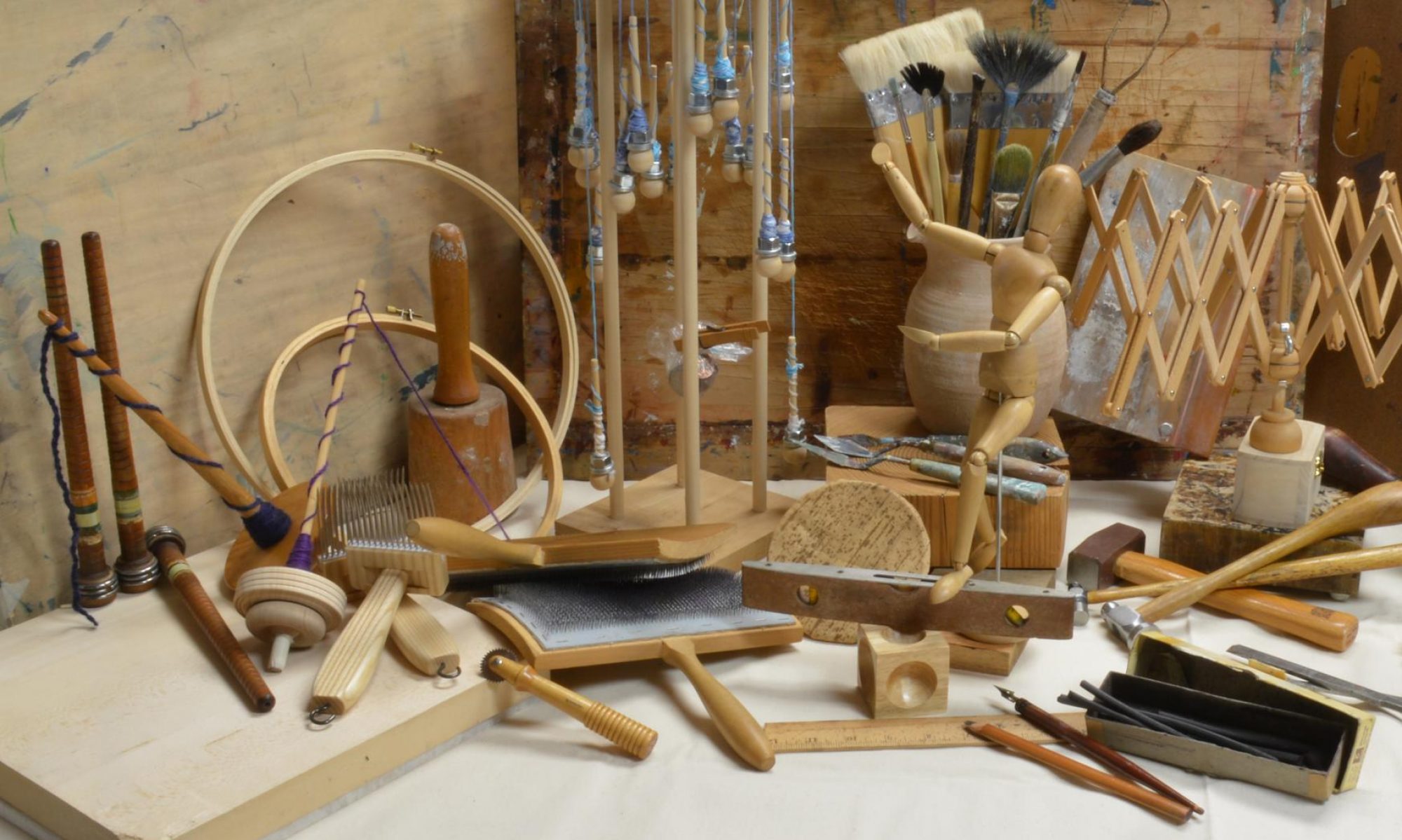
Perhaps you have heard the scolding “just break out of your comfort zone” as a way to battle creative stagnation. Try this instead – broaden your comfort zone. Comfort zones themselves can stagnate and need to evolve to catch up with the artist. Finding your own approach to this process is of course what will put some zing back into your zone. We have several ways that are such old school classics that sometimes we need to refresh our working design habits so the ideas flow in the future. The photography exercises that we create for ourselves are part of that process.
In the hottest part of the summer we tend to direct our energy for wool in imagining projects to make in cooler weather. These daydream projects aren’t meant to go into production in a realistic timeline (or budget), however, the surge of ideas generated in designing those wool projects revitalizes our creativity. Not all art projects have to bear a deadline or production goal. It has been very freeing to set up and photograph these temporary fiber compositions since usually our textile work involves very time consuming techniques. Very quickly these color studies became a playground for mixing textures.
Actually, we have comfort zones, plural. We invent so many challenges for ourselves there has to be a few oasis type places in our studio work. We usually find even our wildest ideas rely on some structure found in our comfort zone of design training.
These examples are art school fundamentals that are reliable and a good way to spring off into more daring approaches in both a particular piece of art or a series.
Neutrals: since we’re working with fiber, for sheep “neutral” means Natural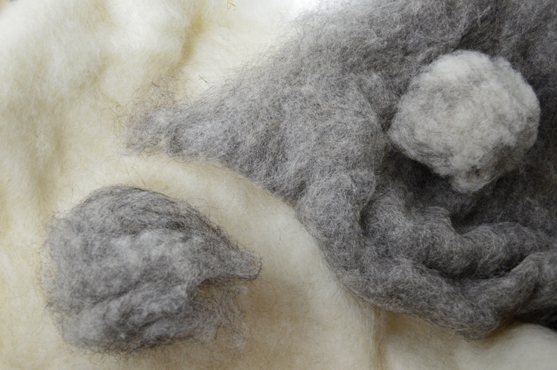
Value scale: white, light, medium, dark and black make an interesting range. A monochromatic scheme can be mild or wild.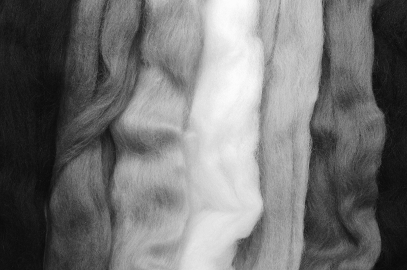
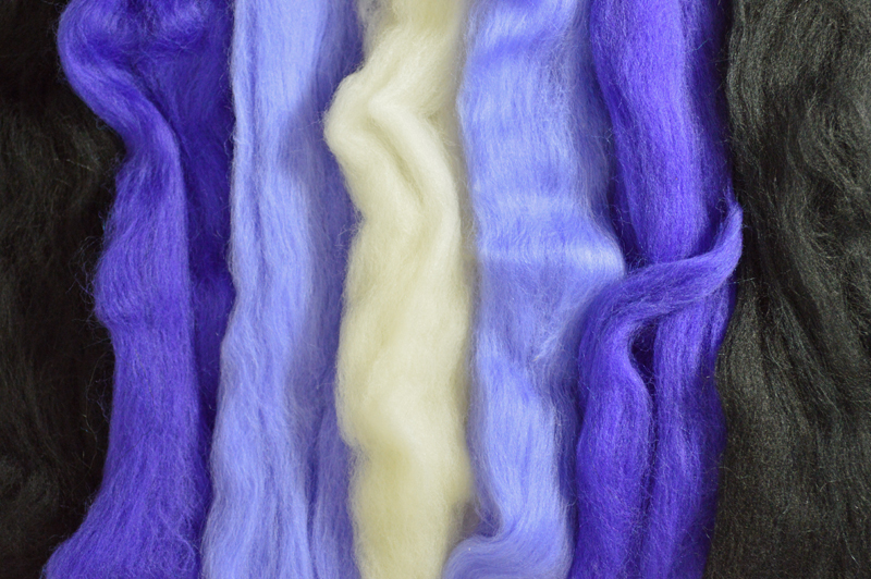
Analogous colors: any three colors side by side by side on the color wheel can touch one’s moods too. There is a soothing rightness about the trio.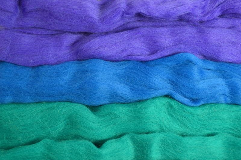
 Of course, other people may dive right into high contrast and/or complementary colors to find their comfort zone. The point is that being aware of comfort zones can help an artist create them as needed and even notice those zones change as the artwork progresses. Comfort zones definitely belong in studios!
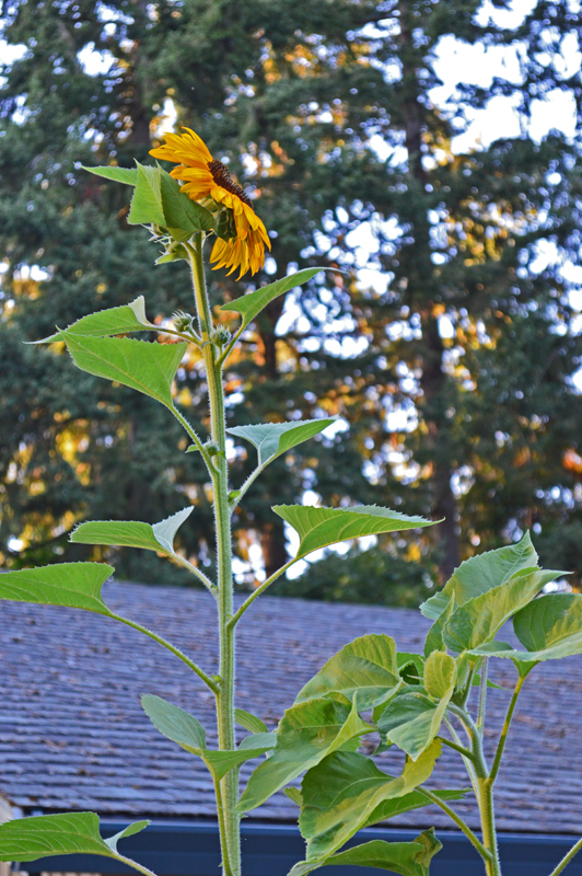
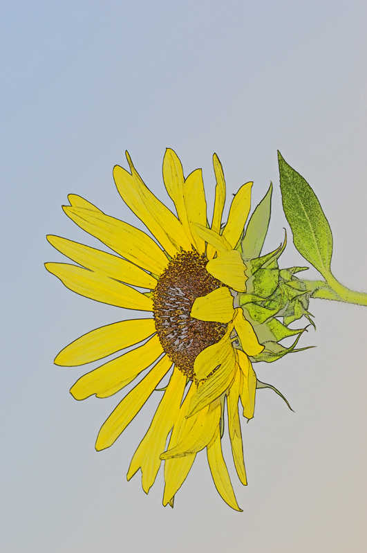
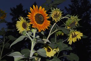
When our uphill neighbor grew these amazing towering sunflowers, how did we manage to get photographs like this with a macro lens?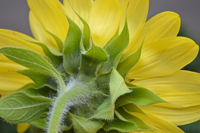
The answer is sometimes you have to put the Photographer on a tripod!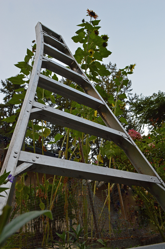
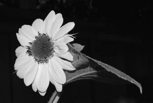
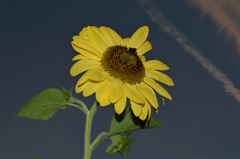
Photographing at Dusk with a flash and close-up focus prevented the sunflower centers from appearing as a flat black disk, especially for photographs later converted to black and white.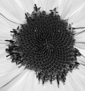
That combination of lighting also tuned out the cars, mailboxes and houses nearby.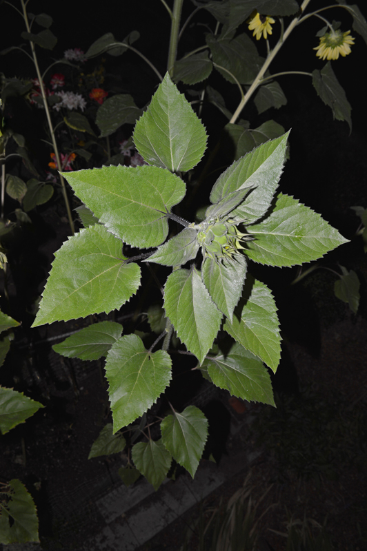
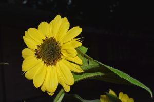
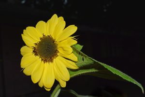
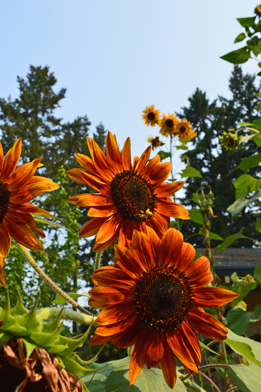
The seed packet promised beautiful-bountiful-bunching-blooms (try saying that 10 times fast!), which have been a delightful subject to photograph.
They also provided the challenge of learning how to aim around and Photoshop out extra blooms for the parts of the Yellow, Red, Orange Tale that focused on a single character/flower.
We’re sure that sunflower seeds must be brain-food, since the flowers have exercised our brains so much!
 “Photoshop vs. Nature: Smack-down in the Garden!” . . . catchy right? This was our Tale’s first title.
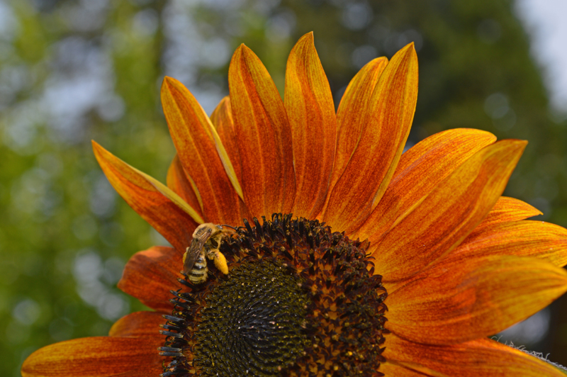
We wanted an interesting presentation to show a sampling of post-photography color changes.
A. As the camera saw it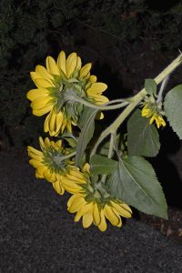 B. Brush, color replace
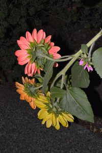 C. Adjust hue/saturation
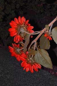 D. Paintbucket
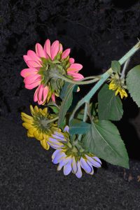
However, as these wonderful sunflowers grew, this working title didn’t really match the garden’s mood.
When our Garden-Enthusiast Neighbor and her husband put up this netting to protect the sunflower bed from local wildlife, the young plants looked like toddlers peeking their noses over a playpen as they grew.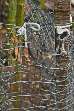
Then, as the flowers inspired photographs like these . . .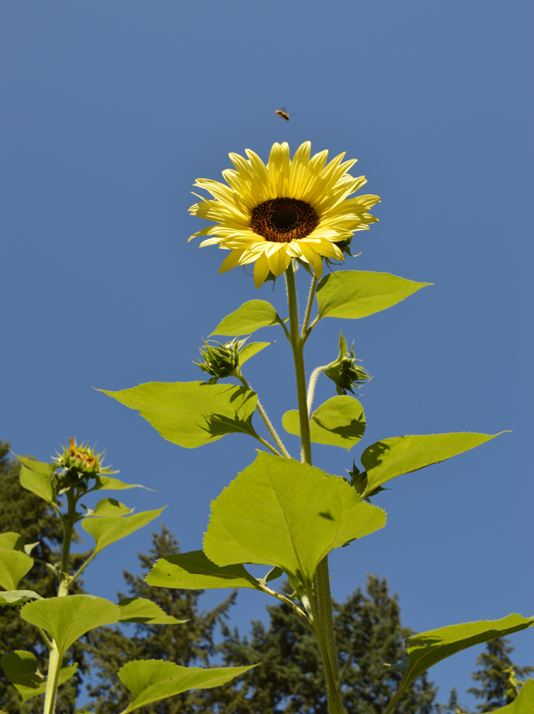
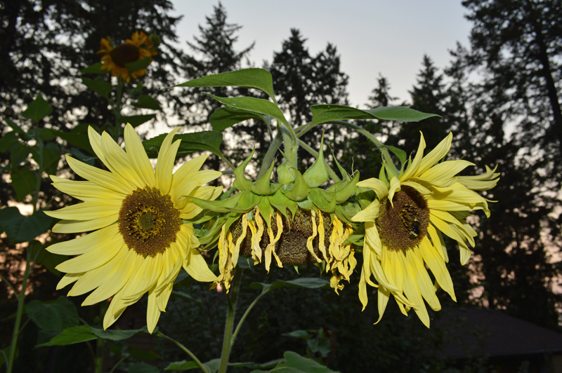
. . . the gist of the tale gradually became a moment of inner conflict on the path to maturity for the young “teen”flowers.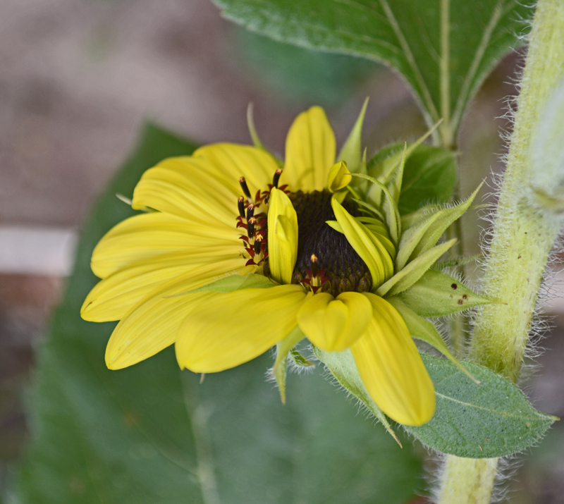
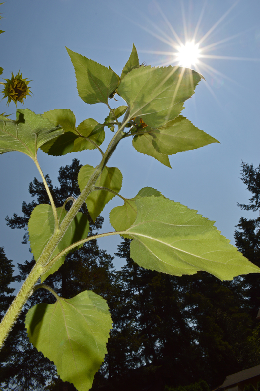
There is a certain irony with the plot of the tale, since photographing the flowers was actually the most peaceful time of the workday!