
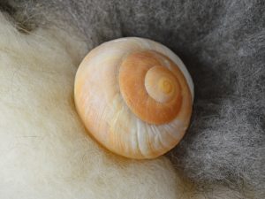
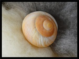
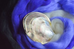
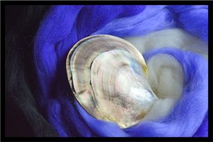
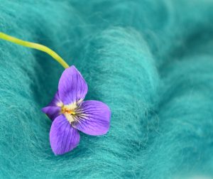
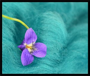
Since we’re reviewing art school fundamentals, another classic one is that artwork’s presentation can really change based on the background color. While we can’t change this particular post to a black background without changing the entire website, these photographs with a black frame will give a bit of an idea for comparison.
We have mixed reviews on which photographs benefit from this black frame. The harsh dark frame looks contrary to the soft texture of the fiber in both the photographs of the snail shell and violet. For the value scale example in the middle, since the black frame picks up the black band in the clam shell and black fiber on the left side of the photograph it works to enclose the right side, which would otherwise seem to spiral out of the composition. The final example provides this post’s punchline!
That is how it is in the studio, sometimes you have to try out several ideas to find what really works best. If we were actually finishing these photographs, none of them would end up with this very narrow black strip, but it is a starting off point for more ideas.
And while a simple coordinating matte can really finish a photograph, if the frame and the contents don’t enhance each other . . . well, see for yourself . . .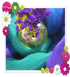 Shall we call this “discomfort zone”?!!!