Computer Holiday

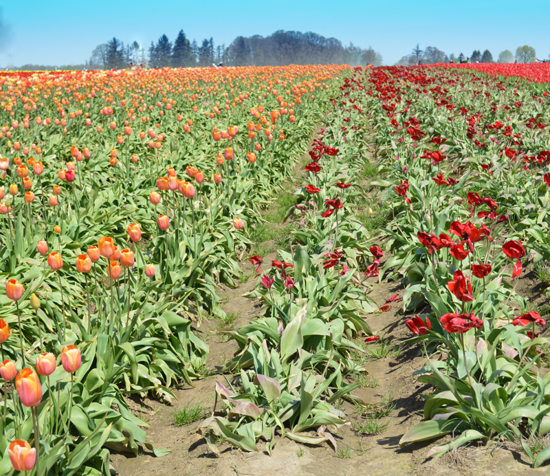
“Perspective Lines Leading to the Horizon Line”, Wooden Shoe Tulip Field

Testing.  Test.  Test.  Test. This is not a real post – it is an exercise in playing with Dashboard features.  So, give your eyes a break from the screen and rest them with long-range viewing.

Try “refreshing” your view of the horizon.

Look for new horizons.

Happy Father’s Day – Part II: Technical Follow Up

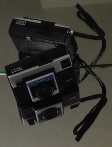
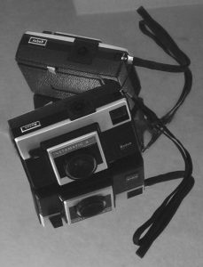
Before and after examples of another photograph from the “First Camera” series illustrate the Photoshop changes.

Before:                                                                              After:


Before

  • Bright idea – to avoid a plain dark rectangle on a light background use mirrors to add interest!
  • Challenge – mirrors reflect EVERYTHING in a small room and have strong edges that become part of the composition.
  • Solution – drape the door with yardage, stand on a chair and aim the camera into the room from the hallway, crop very close to the image to trim away EVERYTHING that is also reflected.
  • Happy accident – the strap and its reflection form a bow!

After

This was a chance to practice using several Photoshop tools, sometimes with very subtle changes.  Working from the original (after cropping) took a lot of trial and error since the background areas were so even.  The “UNDO” button is still very useful!

  • “Paint Bucket” – set to a very low percentage, this tool was used to reduce the brightness of the wedge of the door reflection at the top of the photograph. We liked how it echoed the angles of the little camera, but it needed less contrast so it wouldn’t compete with the subject.  Using a higher percentage darkened the entire background and made the whole thing seem grim.
  • “Heal Tool” and “Spot Heal Tool” – look like a bandage and a bandage on a key chain in the Photoshop side bar.  These features took care of the tiny white line at the very top edge a little toward the left (reminiscent of a scratch on the negative – a hazard in the good ol’ darkroom days).  Removing the lines from the edge of the mirror running through the center of the photograph took patience.  With practice, this will probably become a very useful tool!
  • “Convert to Black and White” – there are several choices even within Black and White.  We picked “Portrait” and reduced the contrast and increased the blue light intensity (both are a sliding scale so the degree of change can be accomplished with nuances).

Having both color and b&w options for photography is rewarding for artists, although not necessarily an instant result!

(P.S. website note:  creating bulleted lists makes all of the double-spacing between items disappear.  This post may end up being edited a few times until we like the layout.)


In Praise of the “UNDO” Button – Part II: Technical follow-up

Rather than dilute the message in the previous blog, we saved the behind the scenes technical captions for this posting.
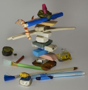
“Eraser Still-Life”  cropped and shadows-lightened version.

This is the original photograph of erasers from all around our work spaces.  After photographing, we had to dismantle the composition because they are such heavily used tools around here!


“Eraser Still-Life” with Angled Strokes Photoshop filter

We miss the texture that actual thick paint applied with a palette knife would produce.  All the same, if a person would like to see a bold version of the image this would certainly provide that.
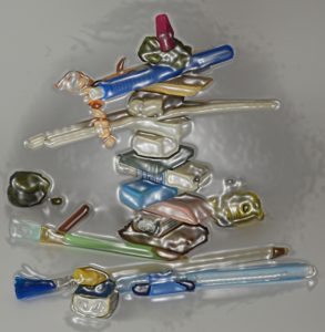


“Eraser Still-Life” with Plastic Wrap Photoshop filter

Well, this is a novel look.  Perhaps someday it will help us design chocolate moulds!
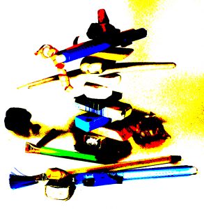


“Eraser Still-Life” with Posterize Photoshop filter

“Posterize”?  Wonder who came up with this name?!  Wonder if they “skateboardize” on the weekends?

Well, this look certainly is different for us.  Quick!  “UNDO”!
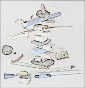


“Eraser Still-Life” with Pencil Lines Photoshop filter

Interesting.  Perhaps playing with lighting will produce more variation in line thickness on the edges.

It is still more rewarding to actually draw the image. “UNDO”!
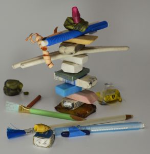


“Eraser Still-Life” with dodging to lighten a few spots

Originally, that dark blob of rubber eraser on the far left center edge was chosen because it was so very used looking.  It has erased miles in its day.  However, in the actual photograph it came across more like a black rock and threw the balance off.  Dodging, or removing a little of the black layer, revealed a tiny hint of the once very bright yellow and gave form to the shape.  That worked so well that we dodged a little on the other graphite covered yellow rubber eraser (second from top) and added a touch on the “cherry on top” red eraser just to see what it would look like.

We feel the final photograph is the most successful (closest to what we were trying to achieve) and are excited to try out the new skill of dodging on future photographs.

Sigh…  I still miss the old, and original, way of dodging with a little disc of paper on the end of a wire waved around in the light of the enlarger over the exposed paper in the darkroom. -A.
 

Refractory Plaster Mould-Making Safety Tips

Refractory plaster has silica added to the plaster to allow the mould to withstand the heat of a firing.  The product and instructions carry a warning to wear a face mask while mixing.  Remember, that also applies to everyone in the work area.  Buddies, helpers and the photographer (for your super YouTube show of this procedure) need to wear masks as well.

Keep all pets out of the workspace until you have wet mopped and wiped down all surfaces.

If working outside, try to avoid a windy day.  Spread a drop cloth and do not sweep up any dried powder, use water to clean up.

Remember all precautions are to prevent airborne particles.

This information will show up again as part of future blogs, but it is important information that can bear repeating and so will be fine for practicing setting up tags while we are learning to change our format on this site!

Recharge Your Batteries

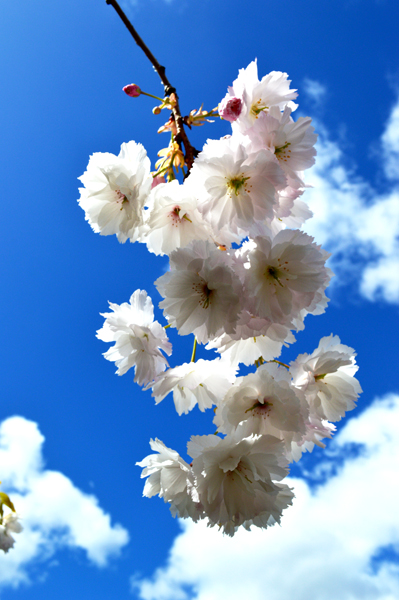
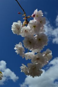
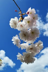
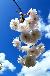
Finally, one day it happens.  Artists need to burst out of the studio.  The pen runs out of ink, the clay is too wet to cast in plaster, the light is not right to photograph the painting.  All those little studio frustrations that normally one takes in stride suddenly overwhelm.  Outside, the sun is shining, birds are singing and most importantly, the pom-pom cherries are in bloom!

Grab the camera and be in the world.  How can they say the artist is only an observer?  True isolation is impossible – the world knows you are part of it and will find ways to remind you.  It may be the way the light shines through petals or a chat with a neighbor.  Bring that invigorating energy back into the studio.  Suddenly those frustrations become small again and very manageable.  Ideas flow and problems feel solvable.

A.  How the camera saw this branch


B.  Photoshop Brightness/contrast            C.  Photoshop Autosmart tone


Burnish to Reflect – Part II: Technical Follow-Up

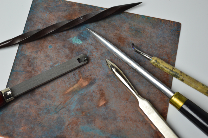
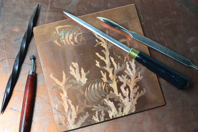
“Marking tools, burnishing tools”

After setting up the photograph to support the text for the previous post, “Burnish to Reflect”, we went on to rearrange the subjects.  The challenge was how to photograph burnishers without making it look like an advertisement for the tool manufacturer.  The compositions that appealed to us the most had both tools to make marks and ones to burnish.  Since the article can be read as about life experience as well as an art technique, having more props still makes the photographs work for the theme.

For the backgrounds, oxidized copper seemed to have so much more character than brightly polished.  Also, it helped cut down on reflecting the light TOO much!  As it was, we used a lot of bounced light rather than direct lighting these compositions with so many flat and curved metal surfaces.


Photography note:  the plate is lifted off the background to change the way the light caught the edges.  The range of warm and cool highlights in the reflections was brought out with multiple lamps each with different watt bulbs.
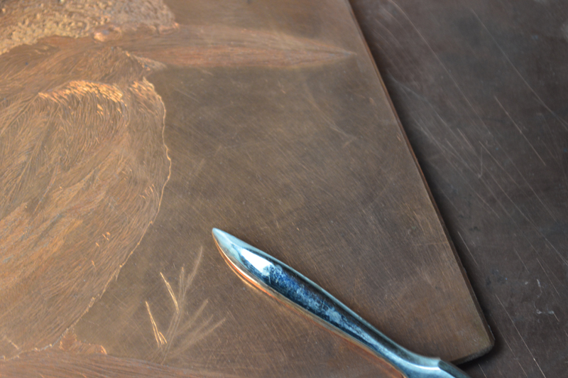
 

Photography note:  Not all “hot spots” are bad, we like the bright reflection on the burnisher’s top surface since it reinforced the idea of bright light playing off shiny spots.  The shape of the hot spot also echoes the shape of the bird’s beak, a happy accident that didn’t show up through the camera lens.
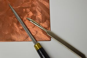
Burnished to Reflect

“Plate in progress with burnishing tools”
Metal, graphite, leather, clay and paper all by the nature of their wayward exterior molecules take reflected light and cast it away from view giving the impression of dullness.  Heavy repeated pressure aligns those surface molecules to create a glossy plane to shine light back and reveal the full form and character of the shape under the surface.

For artists, pressures from deadlines, wants, and both internal and external expectations can be rough to go through.  A positive take on this is to look on the bright side.  See the process as a chance for the artist’s character to shine.

For us, playful creativity is the light that shows the polished places.  Self-discipline and a stern sense of professionalism can carry a project from the drawing board to the display pedestal.  Bouts of playful creativity are what make artists rush with eagerness to peek in the kiln or delight in a fresh sketchpad.  A heap of leftover fiber can become an idea for a series of blog spots (oops! spoiler alert).   Even dull or mundane activities can become inspiration for artistry when there is playful creativity at some point in the process.

Creativity also strengthens our foundation and core, but those are topics for future blogs!

We hope readers feel encouraged, when life feels lackluster or pressured, to look for their own ways to bring playful creativity into their studio  life.

Moving around

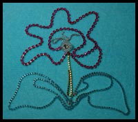
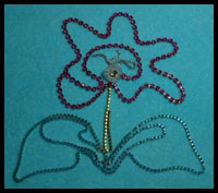
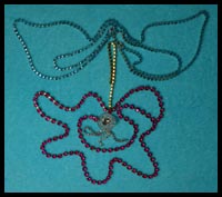
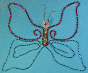
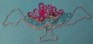
On our drawing boards we are used to moving around photographs as a way to work out a composition.  Photoshop’s rotate and flip features can show a new way of looking at images.  We decided to use a couple of photographs from the Rhinestone series to make a study for quilt block ideas as a skill-building exercise.

Frankly, the more spontaneous way is our comfort zone, but this computer presentation certainly looks more polished – almost a complete project in and of itself.

Now that the Photoshop work is done, you know we will head back to the drawing board to refine the patterns!

Introducing Metcalfstudios.com art blog

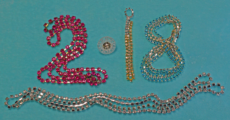
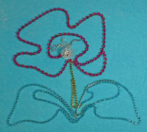
“Rhinestone New Year!”

This is really a pep talk about reengaging creative joy during times of stagnation.

How many of you have boxes (or drawers, sacks, heaps . . .) full of art and craft supplies that are being saved for that special, ultimate project?  We have treasures in our supplies.  Some are waiting for the time or additional supplies to carry out that blast of inspiration.  Some are received from artists who have cleared out those boxes (or drawers, sacks, heaps . . .)  Occasionally, those articles seem glued to the original idea or plan.

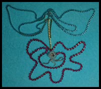
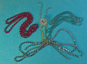
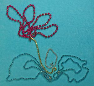
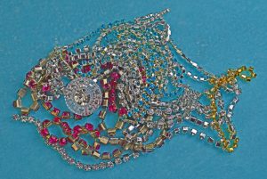
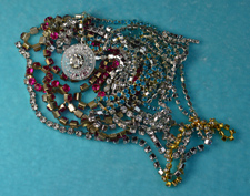
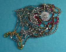
One way to revitalize enthusiasm for art supplies is to unpack them for a play session.  This is what we did with these strands of rhinestones.  The background is hand-dyed silk velvet and made a wonderful contrast to experiment with lighting on the metal and glass.  The velvet was also a surface that let the strands be smoothly pulled and swirled into new images.

Without the pressure of a finished project, ideas flowed from one to another.  We have the photographs to spark future projects.  Plus, we still have those strands to carefully pack away until it is their turn to make the special, ultimate project!