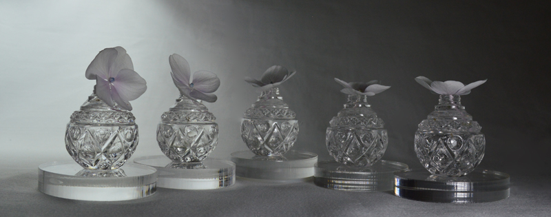
Warmish/Coolish

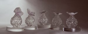
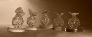
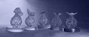
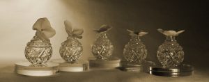
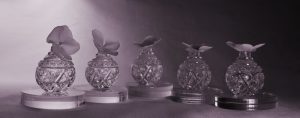
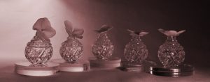
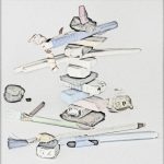
This color photograph is from a series we took to practice Still-Life Studio Lighting.  The set-up is white flowers in clear glass, on clear acrylic, on a white background with two lights.

There are some duplicate features on our digital camera and on the computer’s Adobe Photoshop.  So, this seems like an opportunity to continue the experiments with this photograph and compare the choices.

Camera :  Warm filterPhotoshop:  Warm filter
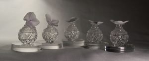
 

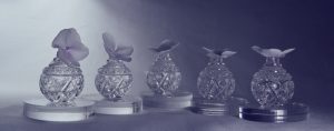
Camera:  Cool filterPhotoshop:  Cool filter
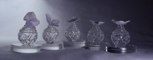
 

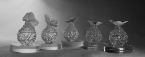
Camera:  Black and WhitePhotoshop:  Black and White
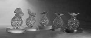
 

Camera:  CyanotypePhotoshop:  Cyanotype
 

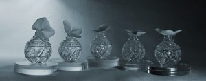
Camera:  SepiaPhotoshop:  Sepia (click on the “brown tree” image)
 

Photoshop:  Purple (click on the “Purple Tree” image)Photoshop:  Red (click on the “Red Tree” image)Photoshop:   Green (click on the “Green Tree” image)Photoshop:  Oops!  Ran out of Tree images to click on!
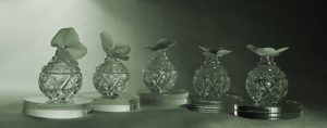
 

Interesting.  Reaction:  casting a warm or cool light on the actual still-life set-up resonates more with us for the immediacy of making and taking the picture.

The B&W setting on the camera looks useful for assessing the arrangement of hue values, especially when making a composition mixing matte and shiny items.  The larger screen of the computer makes it easier to decide on nuances for later black and white conversions.

Also, how much influence does the viewing screen light have over the photograph colors?  We’ll have to print up some of these examples eventually to really compare all of the options.

Frankly, there is a pretty good chance that we won’t press that Purple button again until we have a photograph of a cow (sometimes you just have to go with the obvious!)



Happy 4th of July – Part II: Technical Follow-Up

Sometimes everything works out the first time.

Right time + right place + right camera settings = Happy Photographer!

The flag photographs for the 4th of July post have not had any post camera work.  The 3rd photograph is flipped for the waving flag layout.


What a brief technical follow-up!  But wait, there’s more . . .

Isn’t Creativity’s favorite question “What if?”?

So, in the spirit of “What if?” we tried out these Photoshop filters to see what the results would be.


(Filter, Artistic, Brushstrokes, Sprayed Strokes, Flipped)

As an enlargement this flag looks like it was sewn out of terry cloth.


Now that’s Flag Waving!

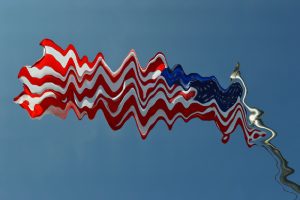
(Filter, Distort, Wave Selection)


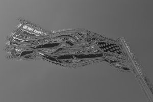
(Filter, Texture, Stained Glass)


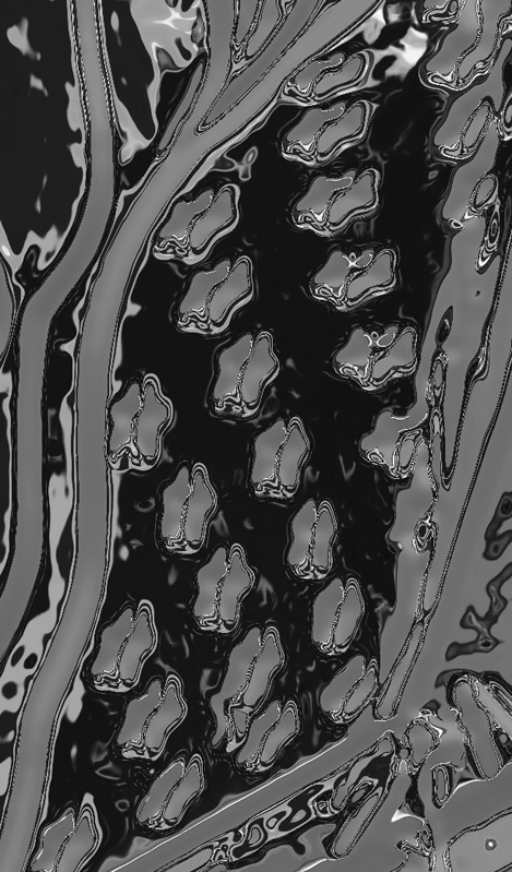
(Filter, Chrome)


“Star-Spangled Abstract” (Enlarged, Cropped, Rotated part of Chrome filtered version above)

“What if?” can certainly take artwork in an unexpected direction.  Possibly leading to a future blog post theme!


Computer Holiday – Part II: Technical Follow-Up

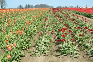
Before:

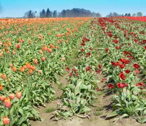
After:


By the time we arrived at the tulip fields, the sun was full blast and there was a strong wind stirring up quite a dust cloud during the whole afternoon.  The dust actually emphasized atmospheric perspective and was kind of interesting in some other photographs, but for this one we wanted a stronger blue as a complement to the orange zones of color.  This is the first time we have tried the blue sky tool in Photoshop – one “click” and instant postcard type sky!  The overlay of blue also darkened the far distant trees as well.  Don’t worry, we won’t overuse this feature, we tend to like the whole range of colors that our skies can be!  Even though this is the first noticeable change in the before and after views, we recommend that all other photo. altering takes place first and the blue sky added last.  It will save dozens of “UNDO” clicks!

Still experimenting with the “Spot Healing Tool” and learning about the “Eraser tool” – that’s how the oak tree’s branches were removed from the left-hand border portion of the sky.  We had pretty good results with removing several of the images of people, some of whom ended up cropped out anyway (oh well, it was good practice!)  Some funny results happened in removing the people standing in the red tulip rows, the lower portions of them were completely replaced with red tulips with the first swash of the “Spot Healing Tool”, but removing the parts with the sky in the background was a huge effort, and still left a blurry distortion.  So, the lesson here is:  when learning to Photoshop . . . tiptoe through the tulips!

Speaking of tulips, we didn’t alter the colors or strong contrast since we were happy with the results.


Computer Holiday

“Perspective Lines Leading to the Horizon Line”, Wooden Shoe Tulip Field
Testing.  Test.  Test.  Test. This is not a real post – it is an exercise in playing with Dashboard features.  So, give your eyes a break from the screen and rest them with long-range viewing.

Try “refreshing” your view of the horizon.

Look for new horizons.

Happy Father’s Day – Part II: Technical Follow Up

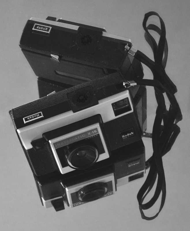
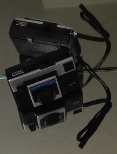
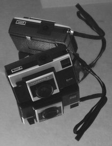
Before and after examples of another photograph from the “First Camera” series illustrate the Photoshop changes.

Before:                                                                              After:


Before

  • Bright idea – to avoid a plain dark rectangle on a light background use mirrors to add interest!
  • Challenge – mirrors reflect EVERYTHING in a small room and have strong edges that become part of the composition.
  • Solution – drape the door with yardage, stand on a chair and aim the camera into the room from the hallway, crop very close to the image to trim away EVERYTHING that is also reflected.
  • Happy accident – the strap and its reflection form a bow!

After

This was a chance to practice using several Photoshop tools, sometimes with very subtle changes.  Working from the original (after cropping) took a lot of trial and error since the background areas were so even.  The “UNDO” button is still very useful!

  • “Paint Bucket” – set to a very low percentage, this tool was used to reduce the brightness of the wedge of the door reflection at the top of the photograph. We liked how it echoed the angles of the little camera, but it needed less contrast so it wouldn’t compete with the subject.  Using a higher percentage darkened the entire background and made the whole thing seem grim.
  • “Heal Tool” and “Spot Heal Tool” – look like a bandage and a bandage on a key chain in the Photoshop side bar.  These features took care of the tiny white line at the very top edge a little toward the left (reminiscent of a scratch on the negative – a hazard in the good ol’ darkroom days).  Removing the lines from the edge of the mirror running through the center of the photograph took patience.  With practice, this will probably become a very useful tool!
  • “Convert to Black and White” – there are several choices even within Black and White.  We picked “Portrait” and reduced the contrast and increased the blue light intensity (both are a sliding scale so the degree of change can be accomplished with nuances).

Having both color and b&w options for photography is rewarding for artists, although not necessarily an instant result!

(P.S. website note:  creating bulleted lists makes all of the double-spacing between items disappear.  This post may end up being edited a few times until we like the layout.)


Happy Father’s Day!

“First Camera, a gift from ‘Santa'”

Our first, and constant, Photography Teacher was, and is, our Dad.  Those early lessons taught us to see the world around us, instead of only looking at it.

Later, as young teens, we considered ourselves lucky to have a darkroom in the tiny basement bathroom.  That experience also helped create our notion that any space can become a studio!

Today, color digital photographs can become black and white with a toggle in the camera menu or with clicks of a mouse on the computer.  It may be faster, but somehow a little something is missing with sunlight streaming through the office window instead of working by the glow of the red safety light of the old darkroom with Dad’s help.

As we work on this post, Dad is busy at his computer designing with Autocad instead of the old drafting table and mechanical pencil way he started his design career.

What a gift these modern tools give us, a chance to continually learn and grow at any age.

In Praise of the “UNDO” Button – Part II: Technical follow-up

Rather than dilute the message in the previous blog, we saved the behind the scenes technical captions for this posting.

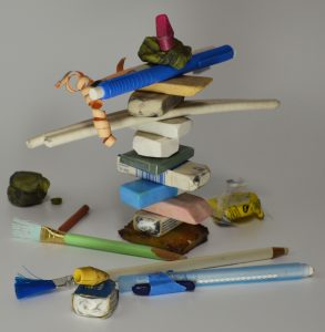
“Eraser Still-Life”  cropped and shadows-lightened version.

This is the original photograph of erasers from all around our work spaces.  After photographing, we had to dismantle the composition because they are such heavily used tools around here!


“Eraser Still-Life” with Angled Strokes Photoshop filter
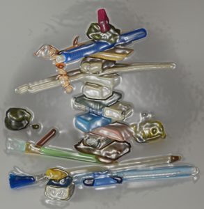
We miss the texture that actual thick paint applied with a palette knife would produce.  All the same, if a person would like to see a bold version of the image this would certainly provide that.


“Eraser Still-Life” with Plastic Wrap Photoshop filter
Well, this is a novel look.  Perhaps someday it will help us design chocolate moulds!


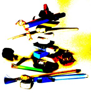
“Eraser Still-Life” with Posterize Photoshop filter
“Posterize”?  Wonder who came up with this name?!  Wonder if they “skateboardize” on the weekends?

Well, this look certainly is different for us.  Quick!  “UNDO”!


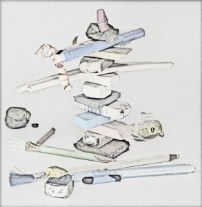
“Eraser Still-Life” with Pencil Lines Photoshop filter

Interesting.  Perhaps playing with lighting will produce more variation in line thickness on the edges.

It is still more rewarding to actually draw the image. “UNDO”!


“Eraser Still-Life” with dodging to lighten a few spots
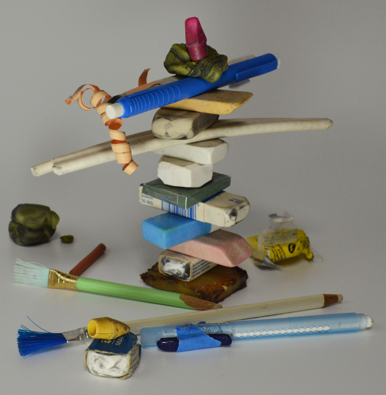
Originally, that dark blob of rubber eraser on the far left center edge was chosen because it was so very used looking.  It has erased miles in its day.  However, in the actual photograph it came across more like a black rock and threw the balance off.  Dodging, or removing a little of the black layer, revealed a tiny hint of the once very bright yellow and gave form to the shape.  That worked so well that we dodged a little on the other graphite covered yellow rubber eraser (second from top) and added a touch on the “cherry on top” red eraser just to see what it would look like.

We feel the final photograph is the most successful (closest to what we were trying to achieve) and are excited to try out the new skill of dodging on future photographs.

Sigh…  I still miss the old, and original, way of dodging with a little disc of paper on the end of a wire waved around in the light of the enlarger over the exposed paper in the darkroom. -A.


In Praise of the “UNDO” Button (or, how to succeed while trying)

“Eraser Still-Life”  various erasers from our studios, “Dodge” feature example
While learning about unfamiliar Photoshop options for our digital photographs the “undo” button has become our most used option.  For those unfamiliar with this feature,  it erases experiments so it is risk-free to try out all sorts of new looks for a photograph.  Click on “Edit” at the top of the screen, click on “Undo” when it shows up and Voila! the photograph is ready to try something  else wild.

When clay is going the wrong direction with a project it is a simple matter of rewedging.  With knitting, “tink”* is the new word for unknitting.  With crochet, one tug on the strand and it ravels as if watching animation.  Drawing not making the mark?  Turn the paper over and start afresh.  Is the typewriter spewing drivel?  Zip out that paper, tear it up, toss it in the blender with water and make a cast-pulp sculpture tribute to your Muse.

Creativity is a PROCESS.  Sometimes it seems one step forward and 90 steps backwards.  Well, isn’t that choreography? – ah ha! more creativity!
Is this a clever pep talk about overcoming fear of failure?  Nope.  That is a travail each artist faces solo, usually in the wee hours of a starless night.  This is a nudge to move from “Gee, I wish I could (_fill in the blank_)” to in-it-up-to-your-elbows-invested in your Dream action!


COMMENCE !

START !!

DIVE IN !!!


*spell it backwards and it will make sense

Refractory Plaster Mould-Making Safety Tips

Refractory plaster has silica added to the plaster to allow the mould to withstand the heat of a firing.  The product and instructions carry a warning to wear a face mask while mixing.  Remember, that also applies to everyone in the work area.  Buddies, helpers and the photographer (for your super YouTube show of this procedure) need to wear masks as well.

Keep all pets out of the workspace until you have wet mopped and wiped down all surfaces.

If working outside, try to avoid a windy day.  Spread a drop cloth and do not sweep up any dried powder, use water to clean up.

Remember all precautions are to prevent airborne particles.

This information will show up again as part of future blogs, but it is important information that can bear repeating and so will be fine for practicing setting up tags while we are learning to change our format on this site!