Computer Holiday – Part II: Technical Follow-Up

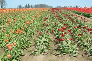
Before:

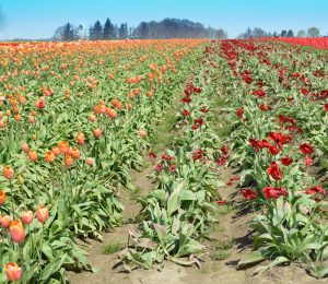
After:


By the time we arrived at the tulip fields, the sun was full blast and there was a strong wind stirring up quite a dust cloud during the whole afternoon.  The dust actually emphasized atmospheric perspective and was kind of interesting in some other photographs, but for this one we wanted a stronger blue as a complement to the orange zones of color.  This is the first time we have tried the blue sky tool in Photoshop – one “click” and instant postcard type sky!  The overlay of blue also darkened the far distant trees as well.  Don’t worry, we won’t overuse this feature, we tend to like the whole range of colors that our skies can be!  Even though this is the first noticeable change in the before and after views, we recommend that all other photo. altering takes place first and the blue sky added last.  It will save dozens of “UNDO” clicks!

Still experimenting with the “Spot Healing Tool” and learning about the “Eraser tool” – that’s how the oak tree’s branches were removed from the left-hand border portion of the sky.  We had pretty good results with removing several of the images of people, some of whom ended up cropped out anyway (oh well, it was good practice!)  Some funny results happened in removing the people standing in the red tulip rows, the lower portions of them were completely replaced with red tulips with the first swash of the “Spot Healing Tool”, but removing the parts with the sky in the background was a huge effort, and still left a blurry distortion.  So, the lesson here is:  when learning to Photoshop . . . tiptoe through the tulips!

Speaking of tulips, we didn’t alter the colors or strong contrast since we were happy with the results.
 

Happy Father’s Day – Part II: Technical Follow Up

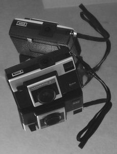
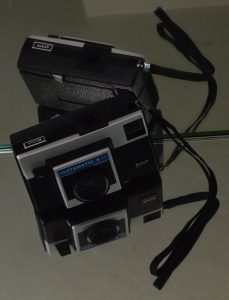
Before and after examples of another photograph from the “First Camera” series illustrate the Photoshop changes.

Before:                                                                              After:


Before

  • Bright idea – to avoid a plain dark rectangle on a light background use mirrors to add interest!
  • Challenge – mirrors reflect EVERYTHING in a small room and have strong edges that become part of the composition.
  • Solution – drape the door with yardage, stand on a chair and aim the camera into the room from the hallway, crop very close to the image to trim away EVERYTHING that is also reflected.
  • Happy accident – the strap and its reflection form a bow!

After

This was a chance to practice using several Photoshop tools, sometimes with very subtle changes.  Working from the original (after cropping) took a lot of trial and error since the background areas were so even.  The “UNDO” button is still very useful!

  • “Paint Bucket” – set to a very low percentage, this tool was used to reduce the brightness of the wedge of the door reflection at the top of the photograph. We liked how it echoed the angles of the little camera, but it needed less contrast so it wouldn’t compete with the subject.  Using a higher percentage darkened the entire background and made the whole thing seem grim.
  • “Heal Tool” and “Spot Heal Tool” – look like a bandage and a bandage on a key chain in the Photoshop side bar.  These features took care of the tiny white line at the very top edge a little toward the left (reminiscent of a scratch on the negative – a hazard in the good ol’ darkroom days).  Removing the lines from the edge of the mirror running through the center of the photograph took patience.  With practice, this will probably become a very useful tool!
  • “Convert to Black and White” – there are several choices even within Black and White.  We picked “Portrait” and reduced the contrast and increased the blue light intensity (both are a sliding scale so the degree of change can be accomplished with nuances).

Having both color and b&w options for photography is rewarding for artists, although not necessarily an instant result!

(P.S. website note:  creating bulleted lists makes all of the double-spacing between items disappear.  This post may end up being edited a few times until we like the layout.)