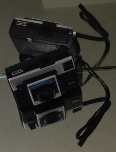
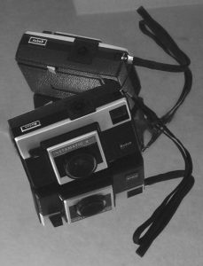
Before and after examples of another photograph from the “First Camera” series illustrate the Photoshop changes.
Before: After:


Before
- Bright idea – to avoid a plain dark rectangle on a light background use mirrors to add interest!
- Challenge – mirrors reflect EVERYTHING in a small room and have strong edges that become part of the composition.
- Solution – drape the door with yardage, stand on a chair and aim the camera into the room from the hallway, crop very close to the image to trim away EVERYTHING that is also reflected.
- Happy accident – the strap and its reflection form a bow!
After
This was a chance to practice using several Photoshop tools, sometimes with very subtle changes. Working from the original (after cropping) took a lot of trial and error since the background areas were so even. The “UNDO” button is still very useful!
- “Paint Bucket” – set to a very low percentage, this tool was used to reduce the brightness of the wedge of the door reflection at the top of the photograph. We liked how it echoed the angles of the little camera, but it needed less contrast so it wouldn’t compete with the subject. Using a higher percentage darkened the entire background and made the whole thing seem grim.
- “Heal Tool” and “Spot Heal Tool” – look like a bandage and a bandage on a key chain in the Photoshop side bar. These features took care of the tiny white line at the very top edge a little toward the left (reminiscent of a scratch on the negative – a hazard in the good ol’ darkroom days). Removing the lines from the edge of the mirror running through the center of the photograph took patience. With practice, this will probably become a very useful tool!
- “Convert to Black and White” – there are several choices even within Black and White. We picked “Portrait” and reduced the contrast and increased the blue light intensity (both are a sliding scale so the degree of change can be accomplished with nuances).
Having both color and b&w options for photography is rewarding for artists, although not necessarily an instant result!
(P.S. website note: creating bulleted lists makes all of the double-spacing between items disappear. This post may end up being edited a few times until we like the layout.)
